E-Commerce
Magazines.com — UI for Clear Comparison
Redesigned pricing & plan cards to handle variable deals and copy while keeping choices simple and scannable.
My experience in designing Magazine.com’s product detail page was a testament to the power of user-centric design, iterative refinement, and collaborative teamwork. From understanding user pain points to delivering a polished final design, every step of the process was driven by a relentless commitment to creating a seamless and engaging user experience.
Problem Statement
- To increase subscriptions by improving the current subscription checkout UI.
Solution
- Redesign the UI for clarity, presenting clear options with consistently placed information for easy comparison. Solve for different numbers of deals and necessary copy.
Insights/Information gathering:
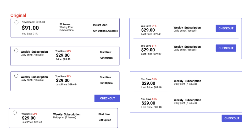
Information gathering
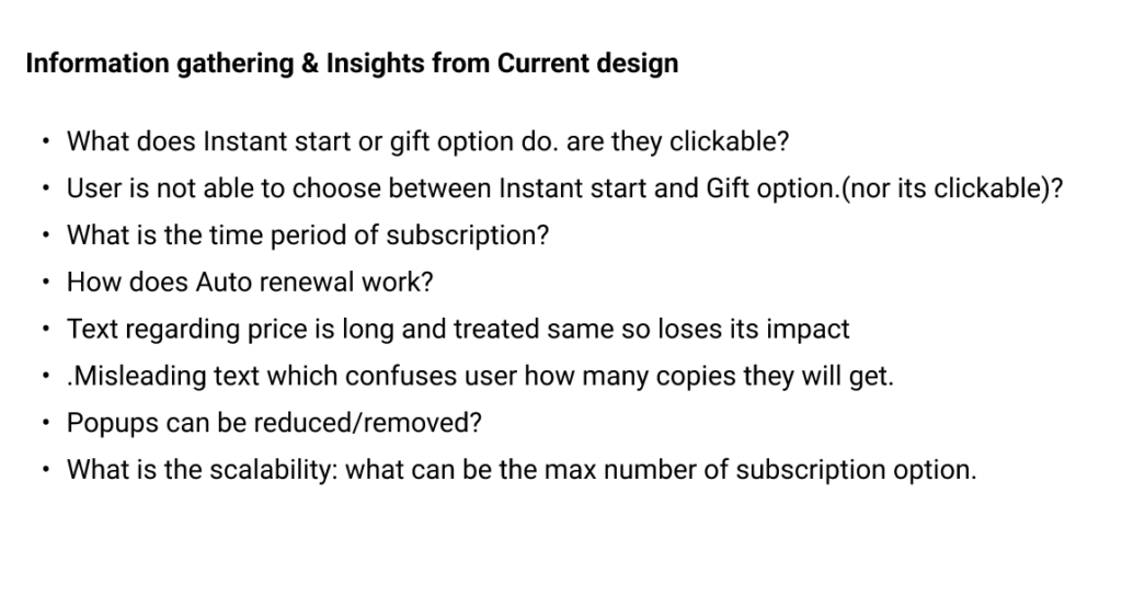
Information gathering
User Flow for different User Scenarios
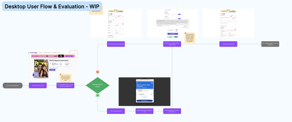
User Flow
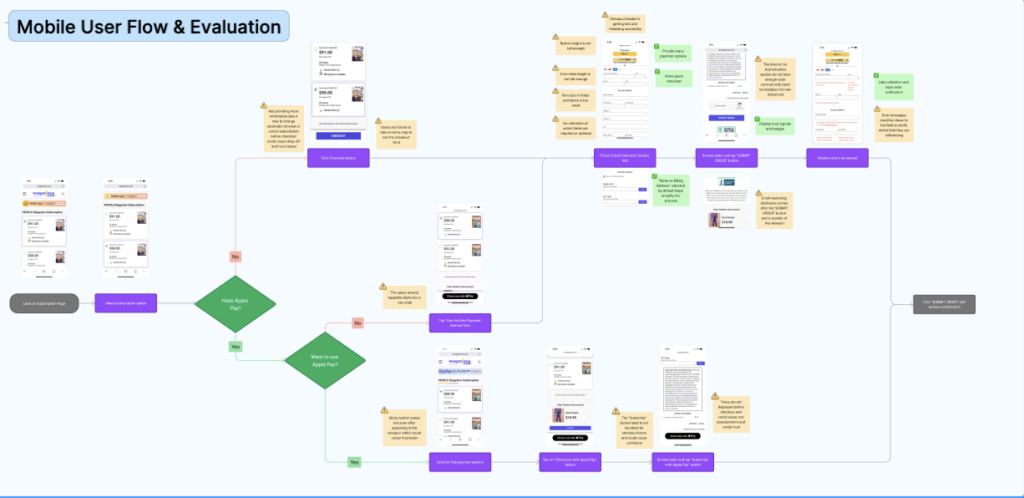
User Flow
Improved User Flow
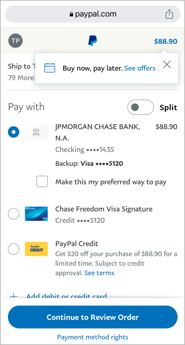
User Flow
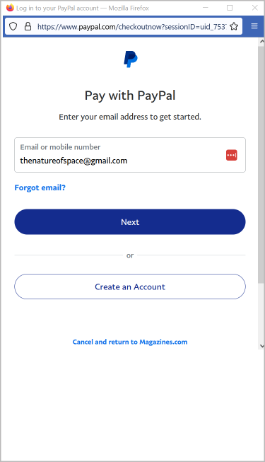
User Flow

User Flow
Design Explorations
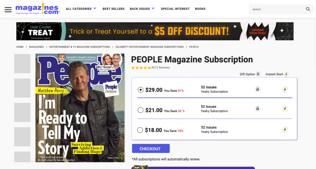
Design Explorations
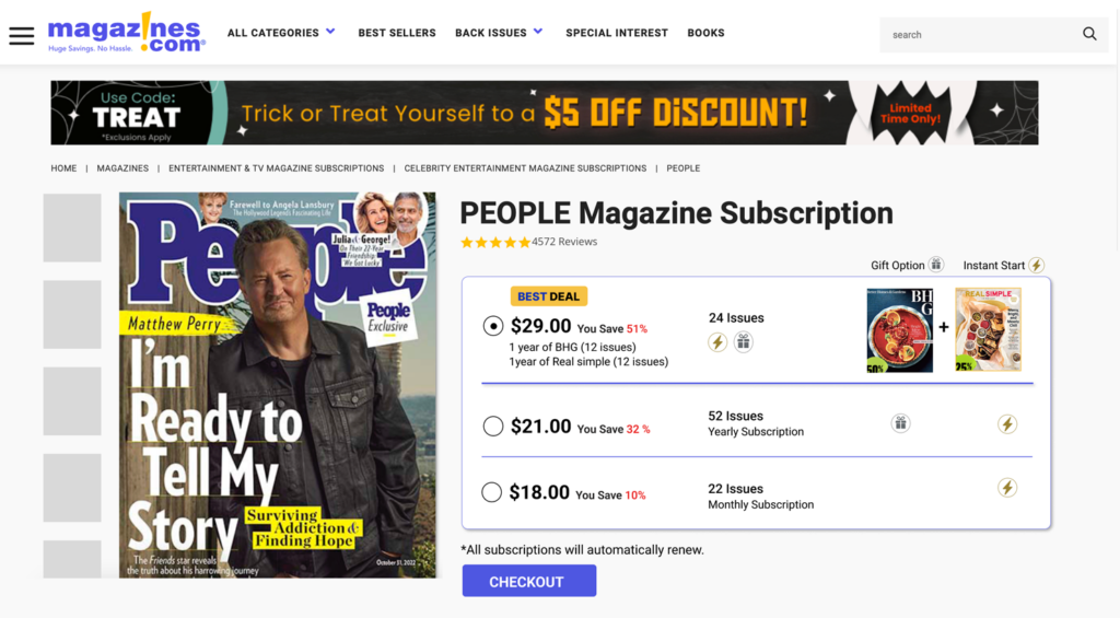
Design Explorations
Final Design
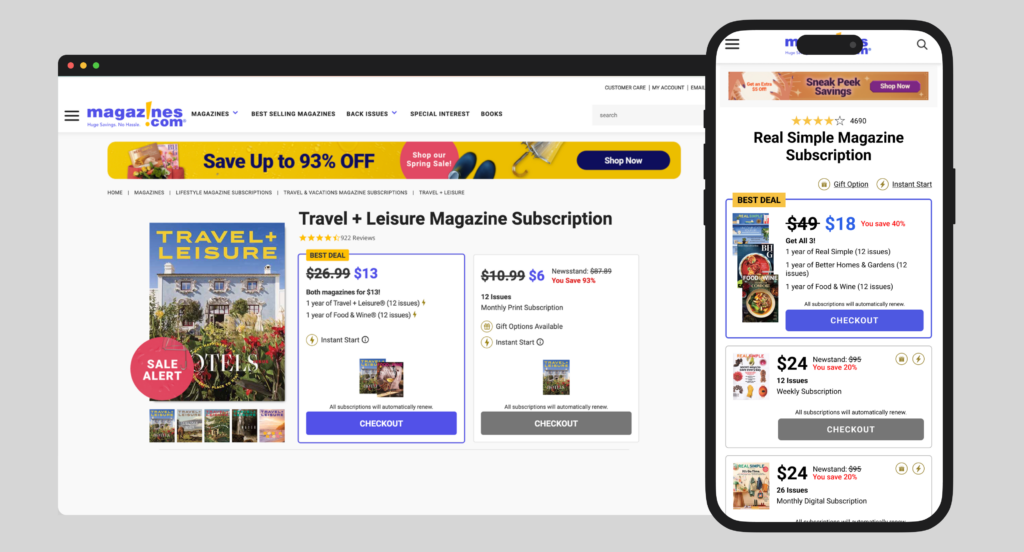
Final Design
Impact
- 10% increase in users conversion.