Enterprise
Windows Release Management — TrackIt
Redesigned dashboards to clearly show release phases & status with simple, discoverable interactions.
Problem Statement
- Problem areas with the previous design were, Long time for loading pages, too much data on one screen causing less visibility, Lack of accessibility in design, Not efficient workflow for daily use.
Requirement
- Improving Workflows and data management.
- Ease of Use, Efficient
- Easily Accessible information (Filters, Dropdowns, etc.)
- User-Centered, Ability to perform CRUD operation.
- Clean and Clutter-free design
Old Design:
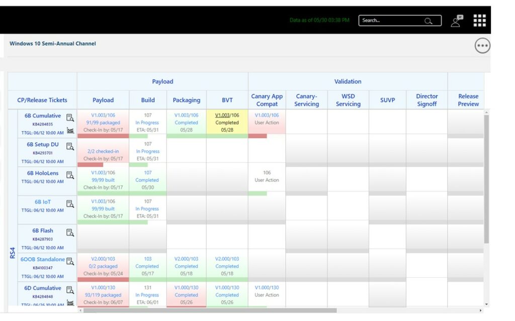
Old Design
Information Gathering
As a first step I started my research with interviewing actual users, observing them perform day to day tasks on tool, knowing pain points, coordinating with developers. This helped me to know possible improvements and additions to work on. Such as -
- Improving Workflows and data management
- Easily Accessible information ( Filters, Dropdowns etc.)
- Managing CRUD operations with ease
- Clean and Clutter free design
- Compliant to Accessibility
- Feedback
- Identify delivery Status
- Better data management (popups, roll over)
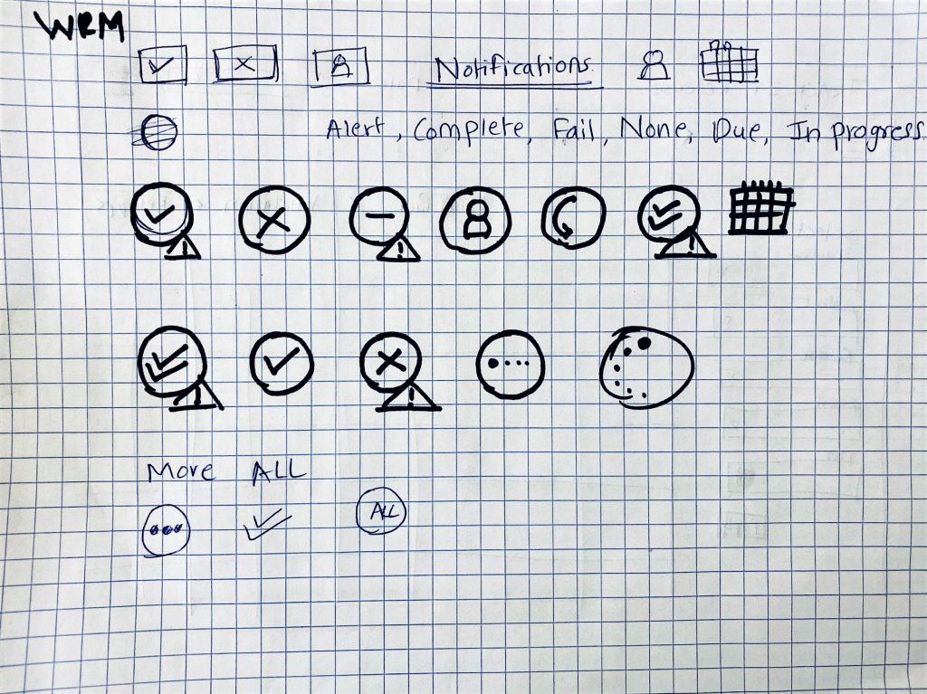
Old Design
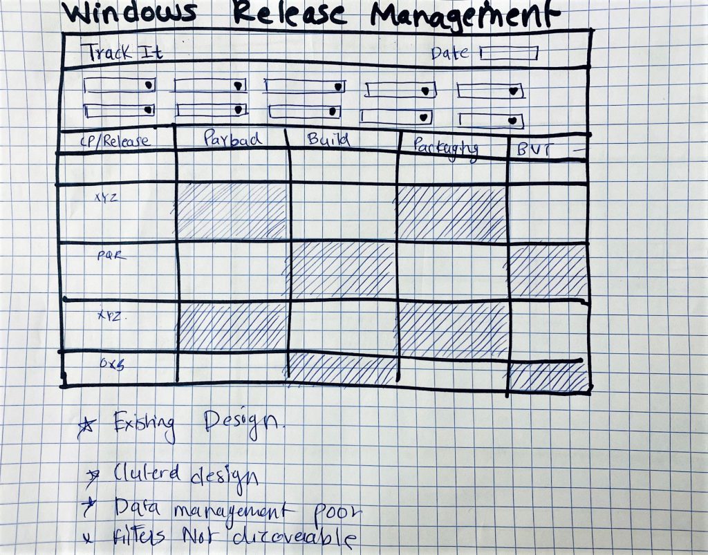
Old Design
Ideation & Collaboration
- Initiated early design exploration with scribbles and sketches to reduce clutter and improve data management.
- Conducted whiteboarding sessions with developers and designers to align on goals and finalize initial concepts.
- Space Management
- Introduced collapsible content panes to present only necessary information on demand.
- Designed collapsible navigation/filter panels to maximize screen real estate for core content.
- Accessibility
- Ensured designs considered a wide range of accessibility needs.
- Used icons along with color indicators for delivery statuses, making information easily distinguishable for all users.
- Efficiency
- Improved user workflow by replacing email-based feedback loops with an inline feedback button for faster turnaround.
- Streamlined interactions to reduce delays and increase responsiveness of the tool.
- Visual Design
- Applied a clean, minimalistic black-and-white base theme to highlight key data elements.
- Focused on contrast and clarity to avoid visual noise and ensure readability on data-heavy screens.
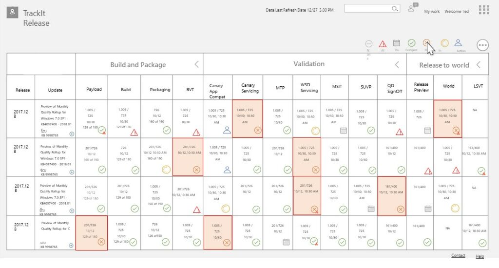
Ideation
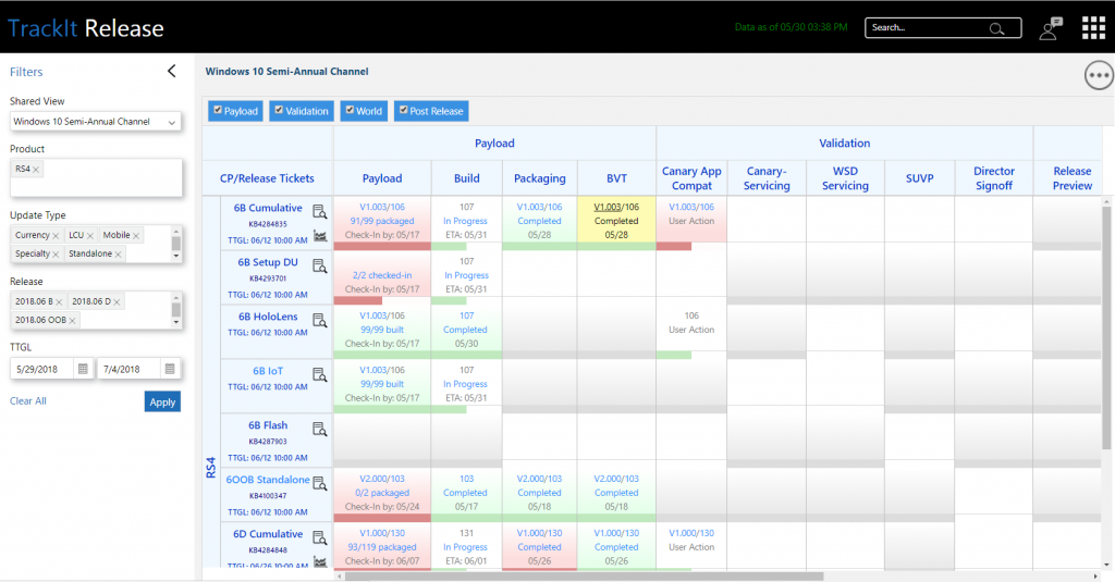
Ideation
Design and Validation
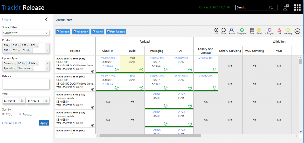
Wireframes
Made prototype and was given to use for set of actual users. This helped to know user point of view and at the same time educate them about the possibilities in advance. Though there was a little learning curve, user feedback was good.
Impact
- 2x Improvement in accessing data.
- Accessibility introduce in design.
- More intuitive and Discover-able action items and required data.
- 2x improvement in turn around time for feedback.