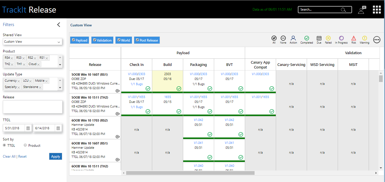
Windows Release Report called Track it tool is an internal tool used at Microsoft to track multiple delivery phases. The ask was to Redesign called for better Usability, Data Management, and efficiency.
Lorem ipsum dolor sit amet, consectetur adipiscing elit. Ut elit tellus, luctus nec ullamcorper mattis, pulvinar dapibus leo.
Problem Statement
Problem areas with the previous design were, Long time for loading pages, too much data on one screen causing less visibility, Lack of accessibility in design, Not efficient workflow for daily use.
Requirement
-
Improving Workflows and data management
-
Ease of Use, Efficient
-
Easily Accessible information (Filters, Dropdowns, etc.)
-
User-Centered, Ability to perform CRUD operation.
-
Clean and Clutter-free design
Process
Information Gathering
As a first step I started my research with interviewing actual users, observing them perform day to day tasks on tool, knowing pain points, coordinating with developers, . This helped me to know possible improvements and additions to work on. Such as,
-
Improving Workflows and data management
-
Easily Accessible information ( Filters, Dropdowns etc.)
-
Managing CRUD operations with ease
-
Clean and Clutter free design
-
Compliant to Accessibility
-
Feedback
-
Identify delivery Status
-
Better data management (popups, roll over)
Ideation
Aligning to Goals and based on research, information gathered, started ideation on portal design with scribbles. Scribbles around how it can be less cluttered and how well data can be managed. Did white boarding session with developers and other designers finalize initial ideas.
Space Management – Collapsible Content Panes to show necessary information instead of showing all. Collapsible Navigation/Filter Pane so user can use full real-estate.
Accessibility – Design for accessible audience. Considering accessibility issues, design which helps all type of users to use the tool efficiently. To make sure Data is easily readable I thought of using icons for different status of delivery instead of only colors.
Efficiency- To make it more efficient experience I had to think about how fast can be turn around time. For example for any issue or suggestion user have to send a separate mail and wait for the outcome or reply. Adding a simple feedback button can help make the experience efficient.
Visual- As there is lot of data on one page, it was really necessary to use clean and slick design. I decided to use white and blacks to make sure other elements are given important and not get merged with background.
Design and Validation
Made prototype and was given to use for set of actual users. This helped to know user point of view and at the same time educate them about the possibilities in advance. Though there was a little learning curve, user feedback was good.
Impact
-
2x Improvement in accessing data.
-
Accessibility introduce in design.
-
More intuitive and Discover-able action items and required data.
-
2x improvement in turn around time for feedback.
